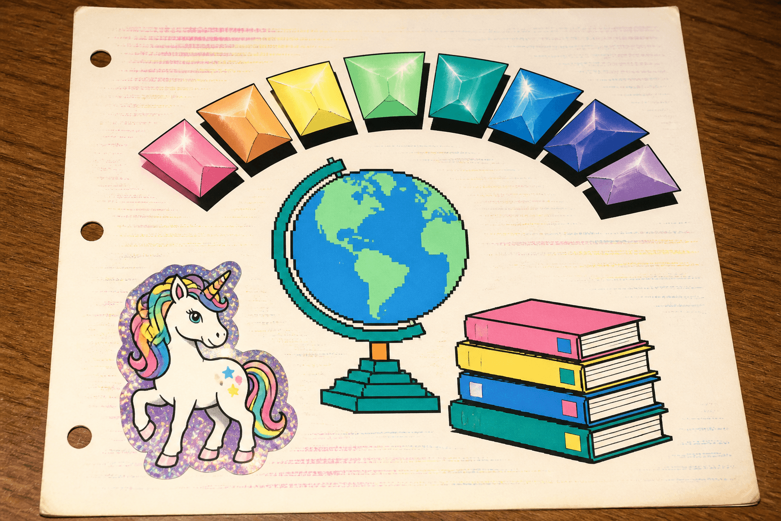
The book report was due Monday. You had not read the book. You had skimmed the back cover and the inside flap, you had read the first two chapters, and you had watched the movie at some point during what may or may not have been a sleepover. None of that mattered, because the only part of the assignment that was actually going to happen tonight was the cover page, and the cover page was going to carry you. Because the cover page had WordArt.
Microsoft WordArt - depending on which year, which version of Office your family pirated from your cousin, and whether you were in Word or PowerPoint - was a button on the toolbar that opened a tiny popup gallery of preset typographic crimes. A grid of thumbnails. Letters bent into arcs. Letters stacked in rainbows. Letters that appeared to be made of chrome, melting, on fire, on a slant, in 3D, in 3D and on fire, on a slant and on fire, with a shadow, with a shadow that went the wrong direction relative to every other shadow in the document.
You clicked the one that looked the most insane. You typed your title. You hit OK. And suddenly your cover page had three inches of warped rainbow nonsense across the top of it, and your name, and the date, and you printed it on the family Lexmark in lurid streaky ink and you slid it into a clear plastic sleeve and you put the sleeve in the front pocket of your Trapper Keeper and you went to bed.
You'd done the assignment.
The Gallery
The WordArt Gallery was the most important piece of UI in late-90s school. A little popup, about the size of a postcard, with thirty preview tiles arranged like a swatch book. You scrolled it - if you had a mouse wheel, which we did not, for a while - and you stared at each preset with the seriousness of a person choosing a wedding font.
There was the rainbow arc. That was the default. Everyone's first WordArt was the rainbow arc.
There was the chrome 3D one with the gradient that looked like a wet hubcap. Adults used this for company newsletters. Kids used it for everything.
There was the squat one that crushed your text into a perfect rectangle, ignoring letterforms entirely, treating "PERSUASIVE ESSAY" and "iiiii" as visually equivalent problems to solve.
There was the wavy one. The slanted one. The one that filled itself with what appeared to be granite. The one with the bent shadow that fell perpendicular to the light source in the rest of your document, which you didn't notice and your teacher didn't mention.
There was the one shaped like a stop sign. Why? Unclear. It was there.
The Cover Page Economy
WordArt was load-bearing for an entire school-paper aesthetic that worked like this: if the content of your report was thin, you compensated with the production value of the cover page. This was tacit. Nobody taught it. We all knew.
A great cover page had:
- The WordArt title in rainbow arc or chrome
- A piece of ClipArt below it, probably a relevant cartoon ant, or a globe, or an unrelated stack of books with a smiley face on them
- Your name in 18-point Comic Sans, centered
- The teacher's name, smaller
- The date
- A border. Page Borders > Art > the one with the apples
The cover page had nothing to do with the report. The cover page was an opening statement about your seriousness as a researcher of, like, Mount St. Helens. It said: I respect this assignment enough to apply a 3D bevel to the word VOLCANO.
You spent forty-five minutes on the cover page and eleven minutes on the actual report. You knew this was wrong. Your parents, if they walked in and saw what you were doing, would tell you it was wrong. But the WordArt was there, and it was good, and once you had the rainbow arc working, you had to also pick the right ClipArt, and once you had the ClipArt, you had to pick the right border, and at some point you were just going to be late, and the report was going to be whatever it was going to be.
The Crash
WordArt would crash Word. Not always. But often enough that you developed a save habit. You'd insert a WordArt. The gallery would open, which was already a moment of risk - sometimes it just hung, the spinner spinning, the computer's poor little 32 megabytes of RAM trying to render thirty preview thumbnails in real time on a machine that was also playing a MIDI of "Greensleeves" from a Hallmark e-card you'd opened that morning and forgotten about. You'd pick a style. You'd type your text. You'd hit OK.
And then sometimes the whole program would die. Just close. The Office Assistant - Clippy, the Cat, the Wizard, Genius the Einstein guy - would not appear to console you. Word was simply gone. And your unsaved cover page was gone with it.
You'd sit there, eleven years old, looking at the Windows desktop, learning something fundamental about computers that would shape the rest of your relationship with them.
You'd reopen Word. You'd start the cover page again. You'd save it this time, with a file name like bookreportFINAL.doc. You'd insert the WordArt again. And again it would work, or it wouldn't. There was no rhyme.
The Removal
Microsoft killed the original WordArt around 2007. They didn't call it killing it. They replaced it with a "modernized" version inside the regular text styling menu, which produced subtle, tasteful, professional-looking gradient text that did absolutely nothing of cultural value to anyone. The 3D bevels were gone. The hard chrome gradient was gone. The rainbow arc - the rainbow arc - was gone, replaced with options that respected your document.
Nobody asked for this. Nobody wanted text that respected their document. We wanted text that screamed.
You can still kind of get the old WordArt back, depending on your version of Office, by inserting a "WordArt object" that opens a tiny window of legacy presets hidden away like a closet of cursed artifacts. The rainbow arc still works. But it's not the same when you have to dig for it. The whole point of the original was that it was right there. A button on the toolbar. A gallery of bad ideas, freely offered, with no warnings about taste or appropriateness or whether your shadow was going to fall the wrong way.
I think about WordArt whenever I see a piece of writing on the internet try too hard. The padded subheading. The bolded random word. The pull quote of something that wasn't worth pulling. The flourish on top of a thin idea.
We did this. We invented this. We were nine years old and we'd written half a paragraph about manatees and we knew, instinctively, that the answer was to make the word MANATEES seven inches tall, in rainbow, on a slope.
The book report was still bad. The cover page, though.
The cover page slapped.